
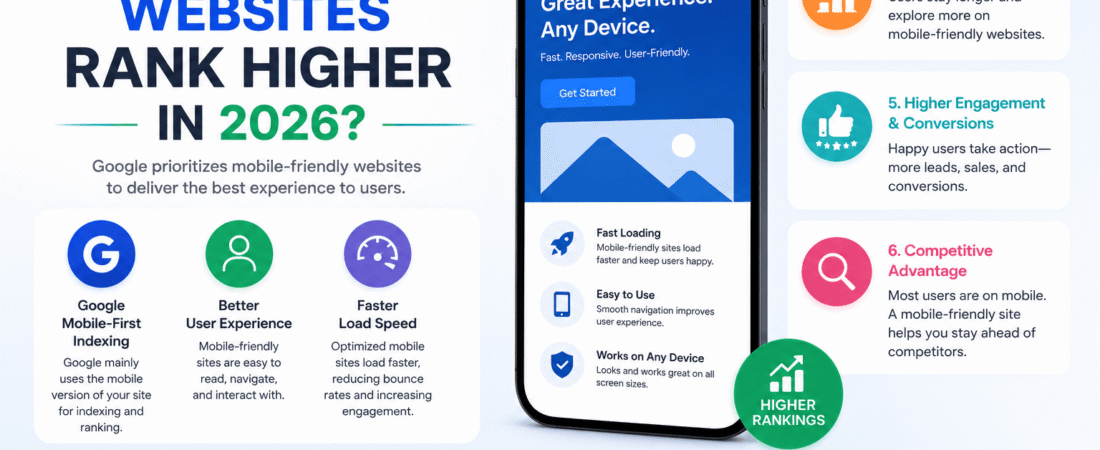
Mobile-friendly Websites Rank Higher
Mobile-friendliness has become one of the strongest ranking factors in 2026 for a few converging reasons: how Google indexes the web, how it measures user experience, and how people actually search. Here’s the full picture.
1. Mobile-first indexing is the foundation
Since Google finished rolling out mobile-first indexing (the default for all new sites since 2019), Google uses the mobile version of a site’s content, crawled with a smartphone agent, for indexing and ranking — even when someone searches from a desktop. This isn’t a “bonus” signal layered on top of desktop ranking; it’s the primary version Google evaluates. While a mobile version isn’t technically required to appear in search results, Google strongly recommends having one.
This has a direct practical consequence: if your mobile site has thinner content, hidden navigation, or missing structured data compared to your desktop site, Google can’t extract as much information from the page, and you can expect to lose traffic once mobile-first indexing applies to your site. Google is explicit that a site can use a different design on mobile to optimize the experience — moving content into tabs or accordions, for example — as long as the actual content is equivalent to desktop. So “mobile-friendly” doesn’t mean “stripped down”; it means the mobile experience needs to carry the same substance as the desktop one, just packaged for a smaller screen.
2. It reflects where the actual searches happen
Google’s algorithm didn’t create this priority out of nowhere — it’s chasing real behavior. More than 55% of global web traffic now comes from mobile devices, and over 60% of all Google searches are conducted on mobile. Search engines are, at their core, trying to satisfy the way people actually use them, so a ranking system that ignored how the majority of queries are performed would be optimizing for the wrong experience.
3. Core Web Vitals: the technical performance layer
Google folds specific, measurable performance metrics into its page-experience signals, and these are evaluated separately for mobile and desktop. As of 2026 the three metrics are:
- Largest Contentful Paint (LCP) — loading speed, with a good score under 2.5 seconds
- Interaction to Next Paint (INP) — responsiveness, replacing the older First Input Delay (FID) metric in March 2024, with a good score under 200 milliseconds
- Cumulative Layout Shift (CLS) — visual stability, with a good score under 0.1
These metrics measure real-world user experience for loading performance, interactivity, and visual stability, and align with what Google’s core ranking systems seek to reward. Crucially, this isn’t measured in a lab — it comes from real Chrome users in the field, at the 75th percentile over a rolling 28-day window, meaning a page only “passes” when at least three-quarters of real visits hit the good threshold on all three metrics simultaneously.
And mobile is where sites tend to struggle most. Recent Chrome User Experience Report data shows LCP is the metric most likely to fail on mobile, with roughly 62% of mobile pages hitting a good score versus higher pass rates for INP and CLS — meaning slow-loading hero images, unoptimized fonts, and heavy JavaScript hit mobile users on weaker networks and less powerful hardware hardest. INP replaced FID specifically because FID only measured the delay before a single first click, while INP evaluates responsiveness across every interaction in a session — a much stricter, more representative bar, and one that’s harder to clear on mobile devices with less processing headroom.
It’s worth being precise about what this buys you: Core Web Vitals function more as a tie-breaker between pages of otherwise similar relevance than as a factor that overrides content quality on its own. A technically flawless mobile page with thin or irrelevant content still won’t outrank a page with genuinely better content. But among competing pages of similar quality, the faster, more stable one wins.
4. User experience and engagement signals
Beyond the raw performance numbers, Google’s ranking systems are sensitive to how users actually behave once they land on a page. A site with cramped tap targets, text that requires zooming, intrusive pop-ups, or awkward horizontal scrolling frustrates mobile visitors, and that frustration shows up as higher bounce rates and shorter sessions — signals that a page isn’t serving the query well. Conversely, a responsive layout, legible type without zooming, and simple, thumb-friendly navigation keep people on the page longer and encourage them to explore further, which is the kind of engagement pattern search systems associate with a satisfying result.
This is also where responsive design earns its keep technically: serving the same HTML on the same URL while adapting the layout to screen size means there’s no risk of duplicate-URL confusion or inconsistent signals between a “m.example.com” version and the main domain — one of Google’s three recommended mobile configurations, and the one it favors for simplicity.
5. Local search amplifies the effect
Mobile optimization matters disproportionately for local intent. A large share of “near me” and location-based mobile searches lead to a same-day visit or purchase, which means a business with a slow or clunky mobile site isn’t just losing a ranking position — it’s losing the walk-in customer actively searching for it right now. Local SEO and mobile UX have effectively merged into the same workstream for this reason.
6. The AI-search layer
One newer wrinkle in 2026: as AI Overviews and other answer-engine features reshape search results pages, the same qualities that make a page mobile-friendly — fast rendering, clean semantic structure, stable layout — also make it easier for crawlers and generative answer systems to parse and cite. A fast, well-structured mobile page isn’t just easier for a human thumb to navigate; it’s easier for an automated system to extract accurate information from, which matters as more visibility shifts toward AI-generated summaries rather than the traditional ten blue links.
Practically, what “mobile-friendly” means in 2026
- Responsive layout that adapts to any screen size on one URL
- LCP under 2.5s, INP under 200ms, CLS under 0.1, measured on real mobile devices
- Full content parity with the desktop version (no hidden or truncated mobile content)
- Readable text without pinch-zooming, and tap targets sized for fingers, not cursors
- No intrusive interstitials or ads that push content down or block the screen
- Images compressed and served in modern formats (WebP/AVIF), with explicit width/height to prevent layout shift
- Same structured data, alt text, and indexable resources on mobile as on desktop
The short version: Google ranks the mobile version of your site because that’s genuinely what most searchers experience, it grades that version on concrete speed and stability metrics gathered from real users, and it treats the resulting engagement (or frustration) as a signal of quality. A site that’s fast, stable, and fully functional on a phone satisfies all three checks at once — which is why, in 2026, mobile-friendliness isn’t a side factor in SEO, it’s close to the whole game.